drawing a line

beyond words

Architectural ideas unlike concepts from other disciplines can’t be described through words and writing alone, and as much as we think that verbal descriptions and persuasion, interpretive dance and handwaving at job-sites might help it is the drawing that describes the architect’s vision. For architects, to speak is to draw. A drawing is a recipe, a set of instructions, ‘the Bible’ around which everything revolves in order to conjure, plan and construct a building and a vision. Our language is visual. Every line, word and dimension carries meaning but as a whole a drawing must be visually clear and balanced. A drawing has a logic, a rhythm and a its own conventions and is in itself a crafted object, an objet d’art. It is this business of drawings that defines us as architects. An architect draws every day. It is the strongest tool in our arsenal to express ourselves the rest of the world. That and an occasional dance routine ;)

3_1.jpg

pluralists. problem solvers. people people.

Plāna is a Los Angeles based architecture studio rooted in design, ecological and social sustainability and effective project management. We want our end product to be a catalyst for positive personal, social and environmental change and be a source of inspiration and joy. Our aesthetic is timeless and streamlined. We develop solutions come from a deep understanding of our clients needs. And we stay around until they are implemented. We enjoy and celebrate the diversity of our clients that include schools, landowners and developers, private individuals and public institutions.
 

material girl

materials palette

a poised palette

When selecting materials for a project we often start with the mood we would like to evoke. In this case we wanted this office building lobby to feel modern, light and warm. Whenever possible we used natural materials and synthetic materials when not. When using the latter we always convey the true nature of the material - for instance, vinyl will never be wood so why does it have to pretend (like in many LVT products)? The materials always need to work with each other and end up forming a family. Paint colors respond to the warmth, saturation and contrast of the other materials in a room for example. Echoes of one material find their way from one area to the next. Scale and light are also important…


11_Corbu.png

let’s get physical

When we work with materials, we often not only work with samples and textures but often request mockups of major building elements and custom features. Architecture occupies physical space, as do we in spite of technology, and it is important to test certain features ahead of time for their overall appearance, relationship with other building elements, longevity, etc. When was the last time you were impressed by a stone when you touched the counter at a bank, the particular way the sun hit a building facade making it sparkle or the tactile nature of draperies in a theater? Let this be an invitation to experience and lean into our environments, their materiality and enjoy…


pluralists. problem solvers. people people.

Plāna is a Los Angeles based architecture studio rooted in design, ecological and social sustainability and effective project management. We want our end product to be a catalyst for positive personal, social and environmental change and be a source of inspiration and joy. Our aesthetic is timeless and streamlined. We develop solutions come from a deep understanding of our clients needs. And we stay around until they are implemented. We enjoy and celebrate the diversity of our clients that include schools, landowners and developers, private individuals and public institutions.


fantastic fun furniture

lobby+with+furniture+callouts.jpg

an all encompassing experience

Architecture does not stop at the exterior walls of a building or even with the interior design and finishes. It goes further beyond the brick and mortar materiality of a building and extends to everything that you can see and feel within a space. This is why furniture plays such an important role in the design and the ultimate experience of space.


logos.jpg

creative elements

At Plana we take special care of the type of furniture we select for any given space so that it will support the function and the aesthetic of any given space very early on in the design process. We work closely with the end user and incorporate furniture plans and selections so that the actual spatial and architectural requirements support their activities and goals for each project.

We love working across scales and fusing all these different elements into a cohesive whole. Because of this extensive expertise, Plana has been engaged by various clients to provide everything from furniture procurement, budgeting and other consultative services as they relate to furniture.


Would you like to learn more? Let us know if you have any comments or questions for us!


pluralists. problem solvers. people people.

Plāna is a Los Angeles based architecture studio rooted in design, ecological and social sustainability and effective project management. We want our end product to be a catalyst for positive personal, social and environmental change and be a source of inspiration and joy. Our aesthetic is timeless and streamlined. We develop solutions come from a deep understanding of our clients needs. And we stay around until they are implemented. We enjoy and celebrate the diversity of our clients that include schools, landowners and developers, private individuals and public institutions.


basement 2.0

mood board el camino basement.jpg

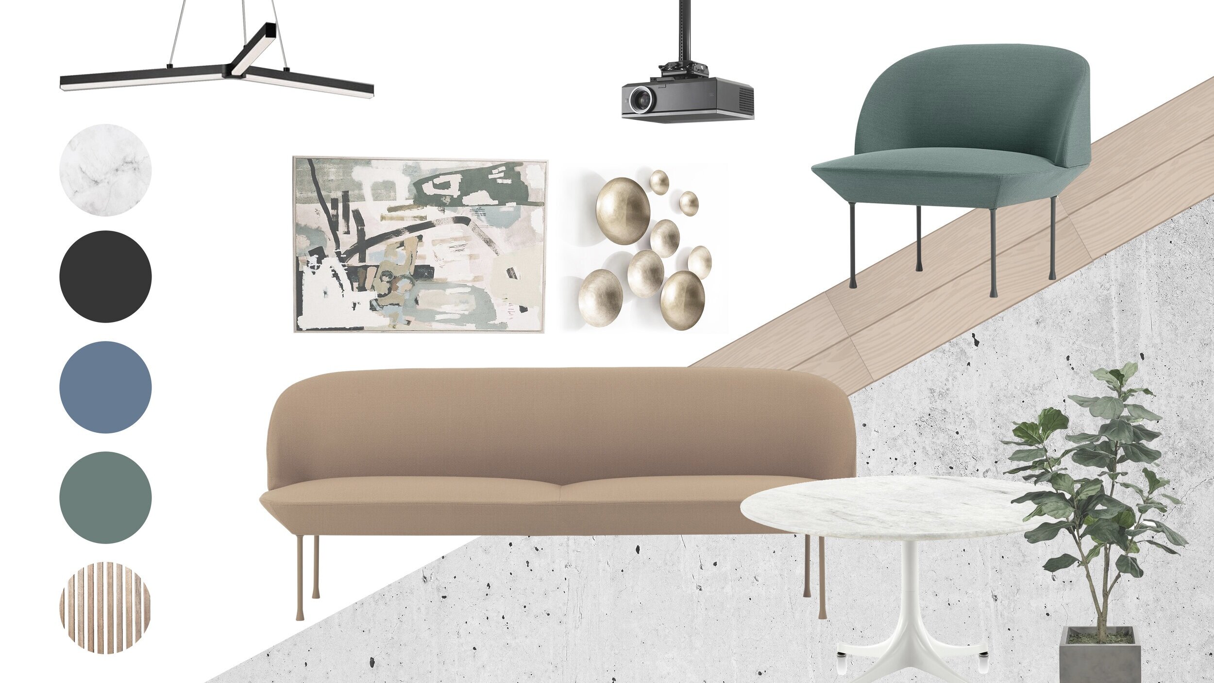
It is known that Architects and Designers use variety of design tools to explore and showcase their projects and connect with clients. Here at Plāna, we love to use mood boards and collages, as they turned out to be a very appreciated and fairly understood presentation format among our clients. It is a chance for both clients and us to get a better sense of materials, colors, and even furniture and decor elements which we are leaning toward in our design.


1_4+-+Photo_1.jpg

Given the underground position of the space, existing configuration of spaces and floor elevations and no natural lighting, it was our mission to renovate this basement for it to become a place of refuge that is warm, cozy and inviting. One of the most important things was to get just right brightness new lighting sources as well as to provide accommodations for acoustics with the introduction of ceiling baffles and wood and fabric wall surfaces. Other major renovation points were a variety of comfortable seating groups, a theater, gaming area, wine and cigar cellar, private wellness rooms and fancy mini bar.

Nice place to spend your coffee (or kombucha) break or after-work hours, isn’t it? Let us know your thoughts!


terrific TIs

1_3+-+Photo_1.jpg

meeting our clients’ needs

It’s a challenge to meet and understand the demands of today’s office space users, who are multitasking and collaborating, while also trying to stay focused on their individual work and privacy. As architects and designers, it is our goal to create office spaces that can enhance and stimulate both, making them user-centered, flexible, private and BEAUTIFUL.


2_12+-+Photo_12+-+Photo_1.jpg

making space personal

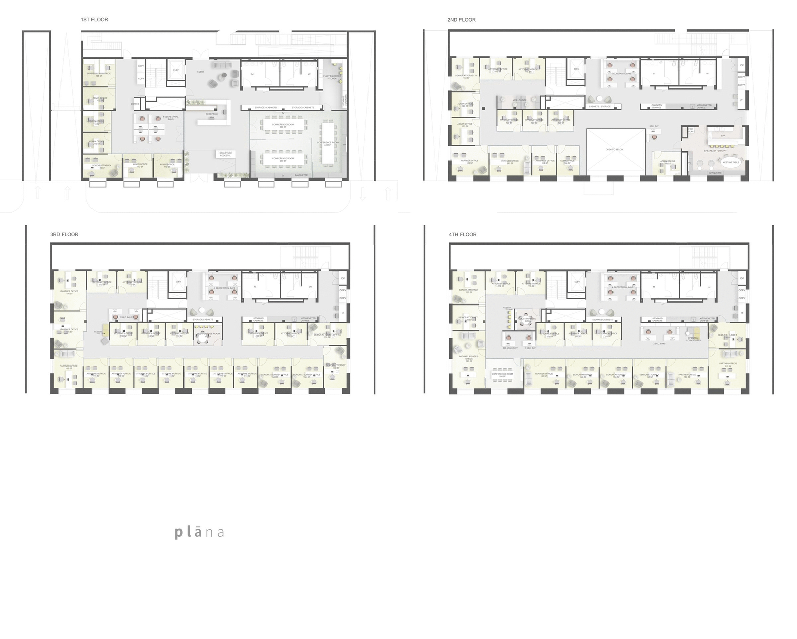
For our El Camino TI project we looked to provide a specific number of private offices for an attorney office while providing multiple flexible areas, a speak easy bar conference room, basement theater and gaming amenities, art gallery space and convertible conference and event spaces. A rooftop deck features plenty of outdoor areas for events, fundraisers or simply to soak up the sun.

TI GIF.gif
 

studio city creative

ezgif.com-gif-maker.gif

the creative workplace

Long gone are the times of shoulder-to-shoulder “cubicles” as we evolved to open office concepts that are supporting creative thinking, collaborative working and innovation. Employees nowadays are looking for something more than just a job behind a desk. Companies are recognizing the need to support their employees need for inspiring spaces which nurture their mental and physical well-being on every level in order to optimize productivity and support the bottom line.


TUJU (4)222.JPG

tujunga creative office repositioning

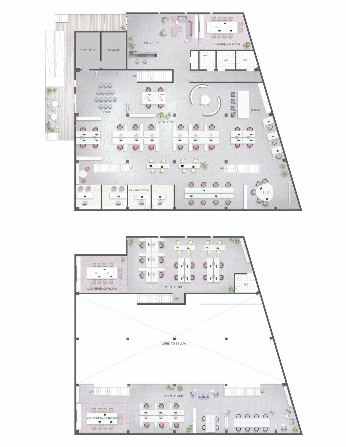
The Studio City Creative Hub started as a dilapidated warehouse and became a dynamic open office space, but more than anything - a place where ideas are born. The concept for this project had a different, organic approach, where flexible office layouts had more space for group work, forums with screens for larger group presentations as well as greenery, designer furniture and accessories for a more artful and home-y vibe. Private offices and enclosed conference rooms are set on the borders and are completely transparent. This way, all activities are integrated, connected, visible and accessible, which leads to improved organization and productivity.